

Exosuit makes sportswear that uses fabric compression technology to improve human performance.
I worked directly with the clients to create a brand identity which communicates their values of performance, passion and innovation.
This new visual language and pitch deck won
Exosuit two million pounds from investors.
Client: Exosuit
Agency: Drew London
Branding & Digital: Georgia Sutherland
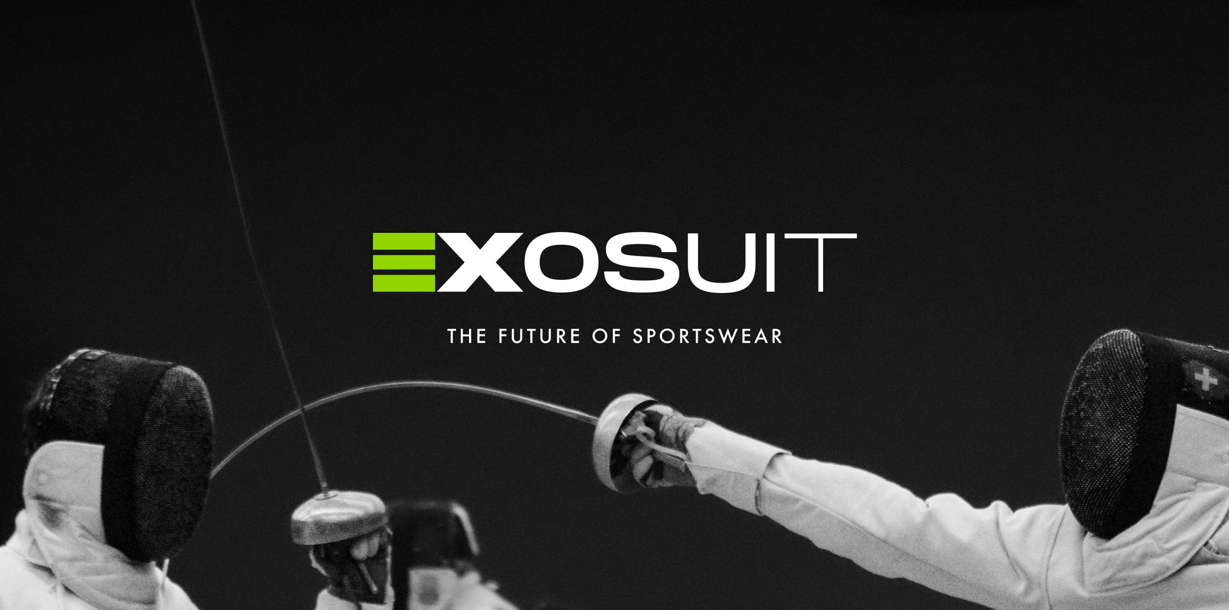
Exosuit


The logotype creates the idea of forward motion, even when static, through the change from thick to thin letterforms. This is further enforced by the negative space between the “E” and the “X” creating an arrow to guide the viewer along the word. I removed the stem of the “E” to modernise the letterform and create a link to Exosuit being “The future of sportswear”.
The logomark, created from the “E” and the “X” in the logotype is combined with words that start with an “EX” providing a dynamic feel to the titles.
The logomark’s negative space arrow is highlighted when used as a repeat pattern in Exosuit’s packaging.


A challenge I faced with this project was giving a form to the invisible feeling of support that Exosuit grants its wearer. I overcame this by designing a smooth line inspired by the athletes movements while wearing the clothing.
To emphasise the energy of the graphic element, I chose the Electric Green from the colour palette. I’ve used this colour sparingly to maximise legibility and to contrast with the Navy and Exo Grey used as the background of sections.


